
Real Print
Holographic Stickers
Holographic stickers pair your artwork with a light-reactive surface, so the color of the piece shifts as the viewing angle and lighting change.
The appeal is movement: the same sticker looks different from one step to the left, and that motion is what makes a small piece feel worth keeping. Designing for it means deciding what should shift and what should stay steady, then giving the important part of the artwork enough contrast and space to hold its own.
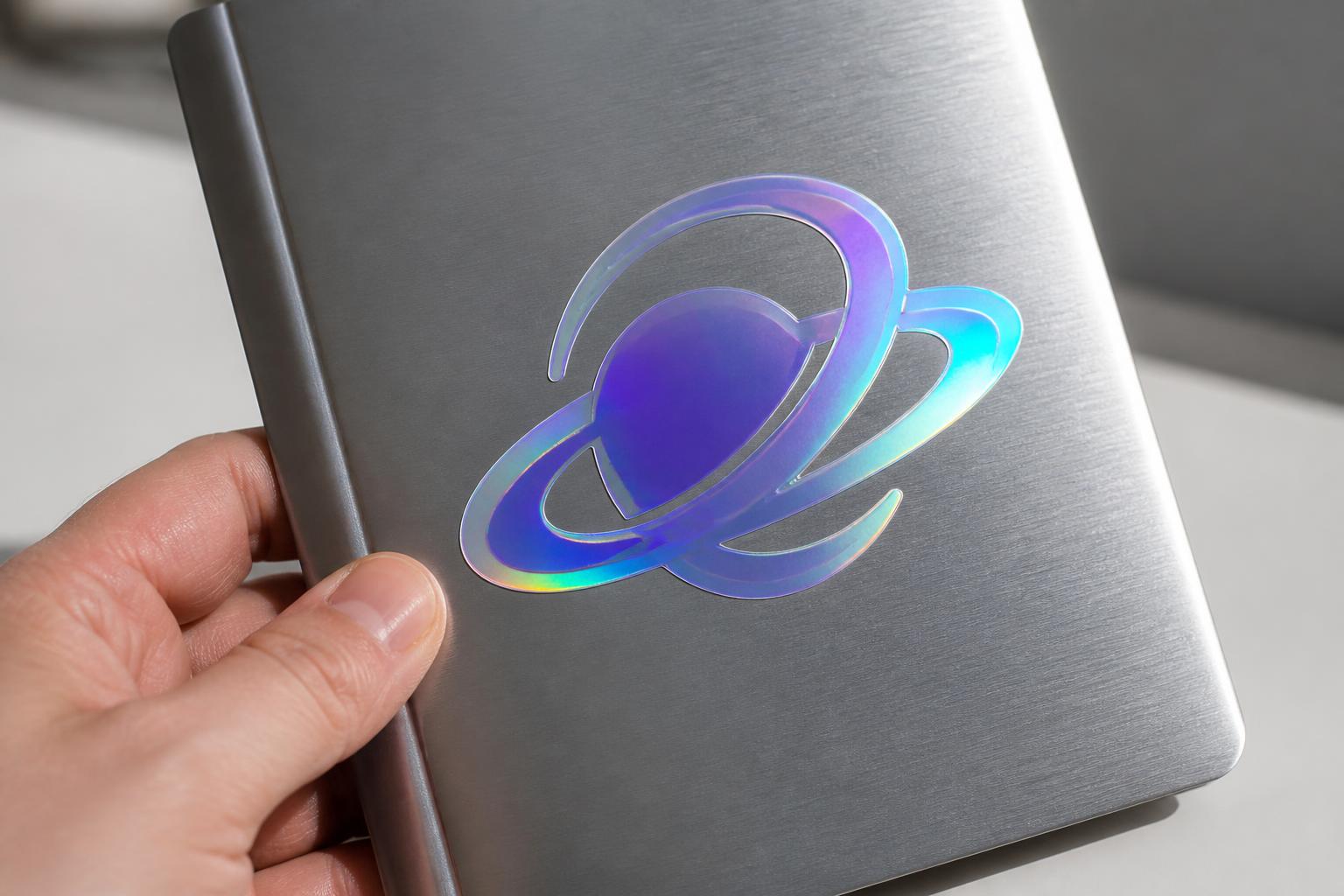
How buyers approach this format
Make the effect part of the composition
Decide early where the surface should move and where the design should stay calm. Treating the shift as a design element, rather than a coating added at the end, keeps the result intentional.
Reserve a stable zone for critical art
Give the logo, name, or key message a quiet area with strong contrast. If the selected product configuration offers an opaque base or finish choice, use it to protect that contrast.
Use a simple silhouette for a collectible feel
Broad, confident outlines read better than contours that trace every notch. A clean shape with a little breathing room around the art feels more like a keepsake and is easier to handle.
Check the finish in real lighting
The effect changes with direct light, diffuse light, and movement. Review the design under the lighting where it will actually be seen before deciding the final balance.
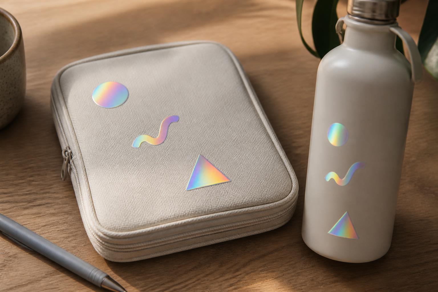
Let light become part of the composition
The rainbow movement comes from a patterned, light-diffracting surface rather than a printed gradient. Because the appearance depends on illumination and angle, areas with lighter coverage let more of that behavior through, while densely covered areas read as calmer and more solid.
A layout that felt balanced on a white artboard can feel crowded once the surface starts to move. Simplify first. Strong silhouettes, bold lettering, clear spacing, and one clear focal point outperform intricate patterns that compete with the effect.
Negative space is not empty here; it is where the material performs. A clean outline around a character, an open border, or a few deliberate exposed shapes make the finish look designed rather than noisy. Deep, dense tones and solid whites create the most reliable reading zones, so give any word that must be understood quickly room and weight.
It also helps to keep the visual vocabulary straight. A light-reactive surface behaves differently from a selective metallic accent, from a speckled glitter texture, from a mirror-like reflection, from a clear material that borrows the surface underneath, and from a standard white background. Those are design concepts to compare, not a claim about what is on offer for this product.
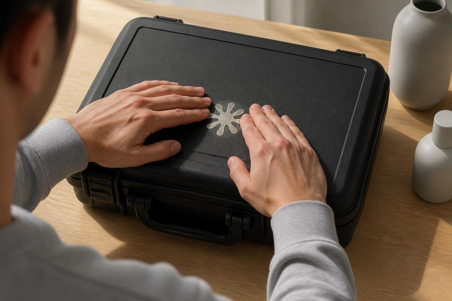
Protect the message, then let the surface perform
Build the artwork at final size and judge it at that size. Vector shapes keep logos and type crisp; raster elements should be high resolution at output dimensions, with text outlined when the workflow expects it. Extend bleed past the intended cut, keep essential content well inside it, and if a custom cut path is supplied, keep it on its own clearly named layer describing the finished outer shape rather than every decorative detail.
Apply to a smooth, clean, dry surface with no dust, oil, wax, or loose texture. Position the sticker without pressing down, anchor one edge, then smooth outward with a clean tool to push air out. Avoid stretching the film, especially around corners, and be cautious on compound curves, seams, and tight radii where reflective materials are less forgiving than plain vinyl.
Give the adhesive time to settle before exposing the piece to repeated rubbing, washing, or harsh conditions, and treat adhesion, environment, and finish choice as things to confirm for your specific case rather than assume. For photography, use controlled indirect light and an angle that shows the shift without washing out the message.
When a light-reactive finish fits the idea
These are visual-design considerations to weigh while you plan the artwork. Choose from the options actually presented in the product configuration; where something is not offered there, treat it here purely as a way to think about the design.
Expressive and collectible artwork
A full light-reactive surface suits characters, edition marks, launches, and pieces meant to be kept and shared, where motion is the point.
Controlled highlights
A selective metallic accent keeps most of the design quiet and reserves the shine for a border, mark, or single element.
Surface texture
A glitter-like effect reads as speckled texture and skews playful, at the cost of fine detail.
Uniform reflection
A chrome or mirror-like effect gives one strong, even reflection instead of a spectrum, which suits a single bold mark.
Substrate-led design
Clear material lets whatever sits behind the sticker become part of the artwork, which works on glass and transparent packaging.
Stable information
Dense instructions, fine print, or anything that must be read quickly belongs on a calm, opaque background. If the selected product configuration offers an opaque base or finish choice, use it to protect that legibility.
Comparing effects at a glance
Use this as a design decision aid rather than a ranking or a list of offered options.
| Effect or process | Visual behavior | Design fit | Design consideration |
|---|---|---|---|
| Holographic film | Rainbow color shift that changes across the surface with angle and light | Expressive artwork, collectibles, limited runs, merch accents | High visual activity can compete with small or thin type |
| Metallic foil accent | Metallic or prismatic response limited to selected elements | Controlled highlights on a calmer background | Needs deliberate accent planning; less all-over movement |
| Glitter finish | Speckled sparkle that reads as visible surface texture | Playful, celebratory, craft-leaning graphics | Fine detail and small type lose definition |
| Mirror or chrome finish | Strong, fairly uniform reflection | Bold single marks and high-impact graphics | Reflections can reveal surface imperfections and hurt legibility |
| Clear material | The surface underneath stays part of the design | Glass, transparent packaging, understated branding | Artwork depends heavily on whatever sits behind it |
| Standard white substrate | Stable, opaque background with predictable color | Information-led labels and everyday branding | No reflective movement to work with |
Before you submit or apply
A short pass through these points catches most of the problems that only show up once the surface starts to move.
- Decide the role of the effect: is it the main idea, or an accent supporting a mark?
- Plan the finished shape and the border so the outline supports the artwork.
- Protect critical text with strong contrast, generous size, and comfortable spacing.
- Make open or transparent-looking areas intentional, not leftover space.
- Review the artwork at final size, not zoomed in on screen.
- Confirm the cut path and bleed where the workflow calls for them.
- Check that vector shapes are clean and raster art is sharp at output size.
- Clean and dry the surface before applying, and make sure it is smooth.
- Account for curves, handling, moisture, and the lighting where it will live.
- Consider a physical sample only where the existing workflow actually supports one.
Common mistakes
The most frequent one is designing as if the surface were plain white stock, so a busy illustration, a colorful background, and small multicolor lettering all compete at once. On-screen color will not match what a reflective surface does in the room, so keep color-critical elements dense and review under more than one light source. Avoid setting delicate type directly over an open prismatic area, keep the cut line away from key features, and remember that heavy abrasion, standing water, strong cleaners, tight curves, and long outdoor exposure challenge any adhesive graphic.
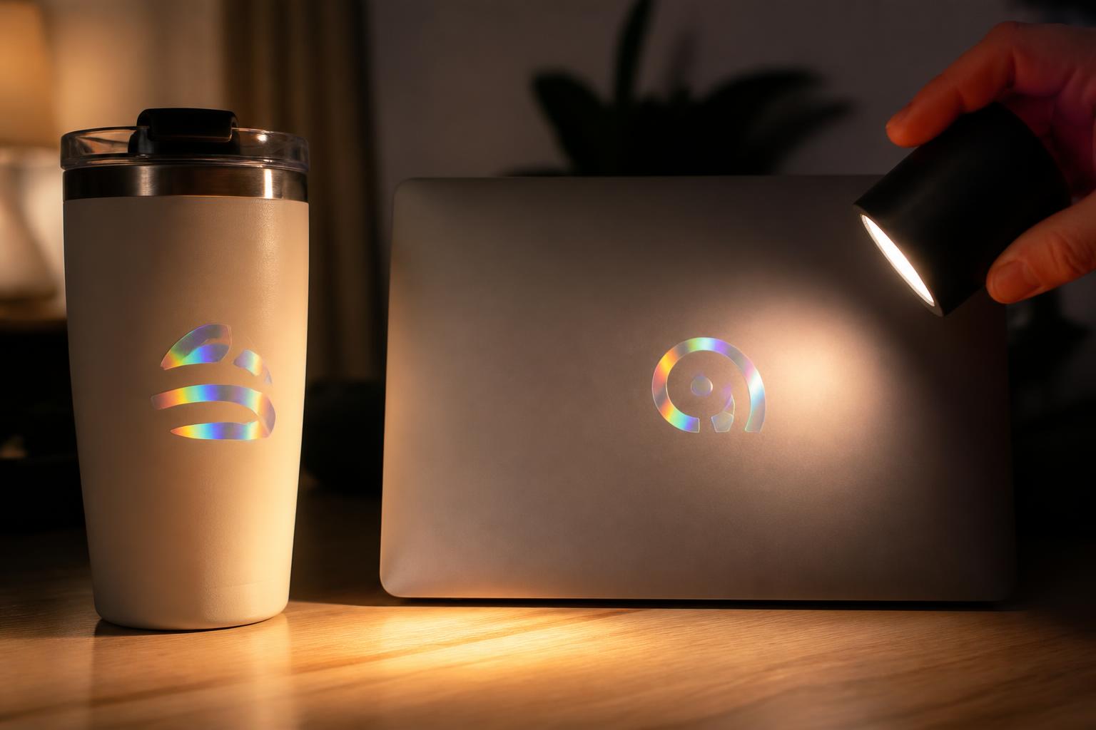
The finish does its work where people actually look
Warm indoor light, a moving hand, a laptop lid catching a lamp: these are the conditions where the shift shows up, and they are worth simulating before the design is locked. A mark that still reads cleanly at a low angle in soft light will hold up everywhere else.
Frequently asked questions
Does the effect show in every kind of light?
The shift is strongest with directional light or a moving viewpoint. Under flat, diffuse lighting it looks subtler. Viewing angle is part of the experience, so judge the design under the conditions where it will be seen.
Can I put a solid logo on a light-reactive surface?
Yes. A solid, heavily covered mark stays readable while the surrounding surface supplies the movement. If the selected product configuration offers an opaque base or finish choice, use it under the logo when color needs to stay consistent.
How do I keep only part of the sticker prismatic?
Design the artwork so exposed areas and covered areas are clearly separated. Borders, icons, and background shapes can stay open while text or a central mark reads as solid. Make that distinction unmistakable in the file.
Are holographic stickers waterproof?
Water performance depends on the specific construction and how the sticker is used, and an occasional splash is very different from submersion or scrubbing. Treat it as a question to confirm for your configuration rather than an assumption.
Can I use them outdoors?
Sunlight, rain, temperature swings, abrasion, and curvature all affect how any adhesive graphic holds up. For anything meant to last outdoors, confirm suitability against the actual exposure instead of assuming it.
What file format works best?
Vector artwork suits logos, type, and sharp shapes. High-resolution raster art works for photographic or painterly designs when it is built at final size. Keep layers organized so open, solid, and cut elements are unambiguous.
Why do some colors look metallic and others look flat?
Coverage decides how much of the reflective surface shows through. Light or transparent areas let it influence the color, while dense coverage produces a more uniform result. That contrast is a useful tool once you plan for it.
Does a matte look remove the effect?
A matte surface softens glare and calms the mirror-like intensity, but the underlying color shift can still appear as the piece moves. It reads as a more muted version of the same behavior rather than a flat surface.
Will one apply to a curved bottle or container?
A gentle curve is usually workable. Compound curves, tight radii, seams, and tapers are harder because reflective films can be less forgiving than plain vinyl. Test the exact container, and never stretch the sticker into place.
How do I photograph one so it still reads?
Use bold type, clear spacing, and an angle that shows the finish without reflecting over the message. Shoot in controlled indirect light and check the image at the size people will actually see.
Related products
Ready to look at this product again from the top?
Back to product details